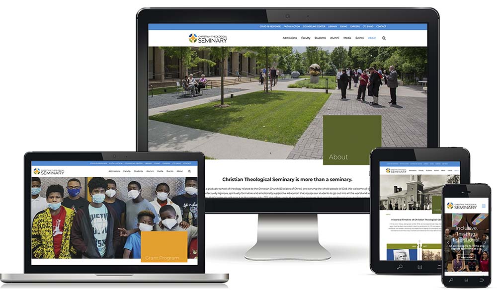
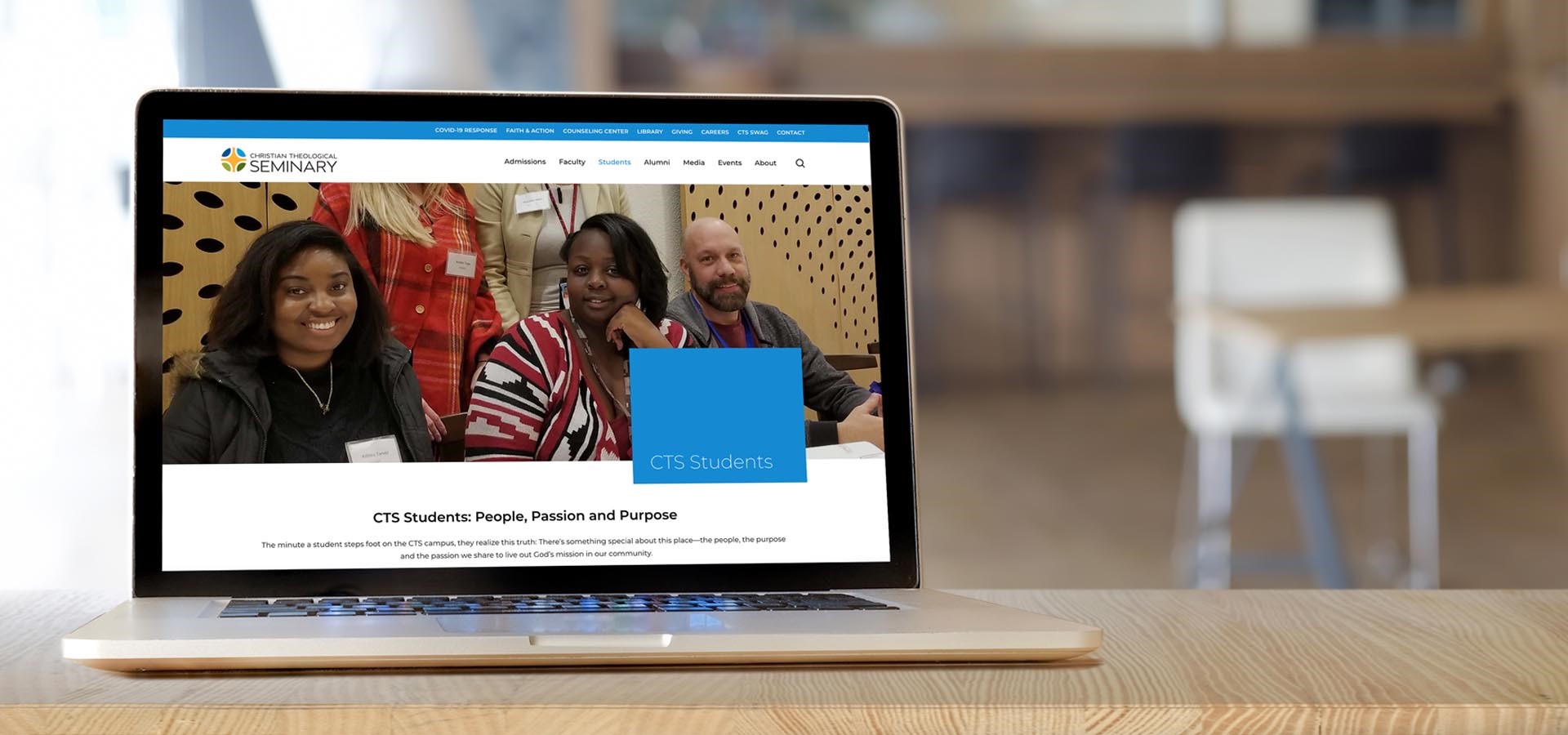
To complement the rollout of a refreshed identity, CTS has been systematically updating the design of our website to create a more dynamic, engaging, and user-friendly anchor for our digital footprint.
The redesign of the website is rooted in creating an engaging and meaningful experience for each user while articulating the personality of our evolving CTS brand and serving our many communication objectives.
STREAMLINED ARCHITECTURE
The new site introduces a streamlined page architecture that leverages large photographic images and dynamic videos to reflect our student body and embracing culture while lifting up alumni, donors and our engaged community of faith. These large visuals invite exploration and break up information so that it’s easy to consume.
INTERACTIVITY
Consistent interactive elements throughout the pages provide convenience and confidence to users when applying for a degree program, scheduling appointments at the counseling center, making a contribution, requesting access to the library and even staying connected to what’s happening at CTS by subscribing to our monthly newsletter, CTS Connections.
EASE OF USE
Information is consistently and intuitively organized so that people know where to look for the data they are seeking when they have never even been to the site before. Global and bread crumb navigation helps users find what they are seeking in as few clicks as possible, while always providing access to other parts of the site.
And, because the number of visitors using mobile devices continues to increase, the site also leverages technology that automatically responds to how we want the site to appear when viewed on mobile devices for a seamless user experience.

ALWAYS SOMETHING NEW
The introduction of a robust media section (with blogs added monthly in a variety of categories) and feeds from our social media–as well as the intentional way the pages are organized–means we can add new content quickly and easily to keep the environment fresh and accurate. BTW, please tag your Instagram posts on campus with @ctsindy using hashtag #ctslife so it shows up on the student’s section!
FRAMEWORK FOR GROWTH
Site organization, stable navigation, simplified language and more interactivity supports not only our visitors, but also our ability to utilize the website as a framework to support our future. The site organization replicated footer navigation and simplified language help our content perform better organically in search engines–which in the long run–supports cyber authority, visibility, and future growth—of the site and the seminary.
Evolution is important for the life of any institution, and an updated website is a key part of the seminary’s digital footprint and our public presence as we continue to take bold steps into the future with a new strategic plan and renewed commitment to our mission. We invite you to check it out and let us know what we can do to continue to improve it!


